My Picks: Budget-Friendly Accent Tables

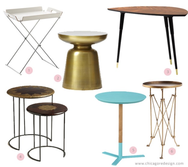
Accent tables, side tables, occasional tables… whatever you want to call them, these babies are great for convenience and adding character to any room.  Whether you are looking for something modern, elegant, funky, or global, there’s a side table out there to suit your tastes and needs. Here I feature 6 fantastic accent tables that are not only easy on the eyes, but also on the wallet.

Beautiful and Budget Friendly Accent Tables | Chicago ReDesign

  1. Formosa Tray Table, CB2, $49.95 – Available in white or black. With a removable tray this modern table provides plenty of convenience and style.
  2. Martini Side Table, West Elm, $149 – Available in antique brass (shown), silver, or white. Sleek and sexy, this swanky side table would look good in any room of the house.
  3. LOVBACKEN, Ikea, $59.99 – For all you Madmen fans out there, add a mid-century vibe to your space with this great-looking side table.
  4. Priya Inlay Nesting Tables, World Market, $149.99 set of 2 – Beautiful inlay patterns and exotic materials make this set of nesting tables the perfect addition for on-trend global accents.
  5. Discus Aqua Side Table, CB2, 79.95 – A bright pop of color makes this table feel youthful and fun.
  6. Metal Accordion Side Table, urbanoutfitters.com, $78 – The unique, accordion legs and detailed feet on this table create a versatile piece that would look right at home amongst both antiques and contemporary furnishings.

Signature

Related Posts:
share request

{Guest Post} Why You Should Change Your Window Coverings (and How)

The following is a guest post from Danielle Mcann of Melbourne Blind Company

When changing the window coverings in your home, you have the opportunity to completely change the look and feel of your home. You’ll be surprised at how quickly new blinds or curtains can change any living space, from a change of style to just a change of colour, it’s like a small scale renovation.

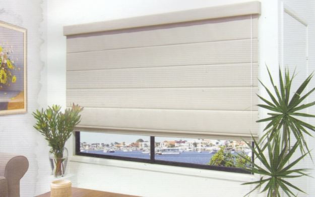
Before you choose your windows’ new look, there are a few things you should think about first. Whatever the reason you are deciding to update your coverings, perhaps they are outdated or broken, or maybe you just want a different style or colour, you should think about the things you dislike about your current window coverings and decide on what it is that you want. Perhaps your current curtains let in too much light, so you might want to consider changing them to thermal lined blinds, like these from the Melbourne Blind Company,  ensuring that light as well as heat and cold don’t enter the room through the window. This is also a great way of naturally controlling the temperature in your home, which helps reduce energy costs.

romanblindsSource

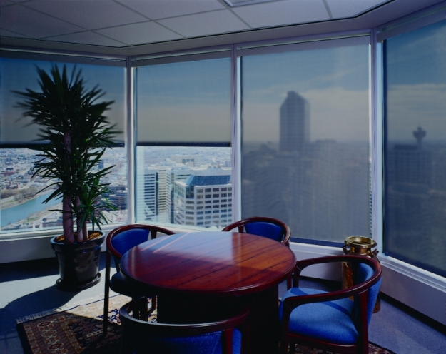
Perhaps you want to take advantage of natural light during the day but keep prying eyes at bay, you could try dual roller blinds which have both a sheer and block-out blind in one, giving you added versatility. They also create a more streamlined look, adding a modern touch of simplicity to any home.

sunscreen 2Source

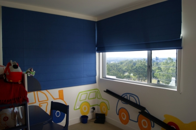
If you are busy keeping up the family home, you probably want an easy option for your kids rooms as well. Something that doesn’t dirty easily, a window covering that is functional and tough wearing perhaps? In this case, a roller blind could work well as they come in a variety of colours, allowing you to customise the look of your child’s room, separate but complimentary to the rest of your home.

blinds1Source

There are so many options when updating your window coverings, but with a few helpful tips in mind, it should make the process a little easier. Just remember to consider style and functionality, you’ll be sure to find the right blinds for you.

Thanks for the great post Danielle!

Signature

Related Posts:
share request

(Re)Treat Yourself!

As the lazy days of summer come to an end, and things seem to get busier and busier, we all need a place to retreat to at the end of the day; a sanctuary where we can relax, de-stress and treat ourselves to some creature comforts. Here are a few simple ideas for creating your own at-home refuge.

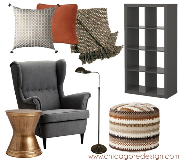
If you have limited space a comfy chair, reading lamp and ottoman should do the trick. Add a soft, warm throw and a few pillows to up the cozy factor. For more privacy add a floating bookshelf or even a single curtain panel hung from the ceiling.

At-home retreat | Chicago ReDesignTassle pillow| Orange Pillow | Throw | Bookcase | Chair | Side table | Lamp | Ottoman

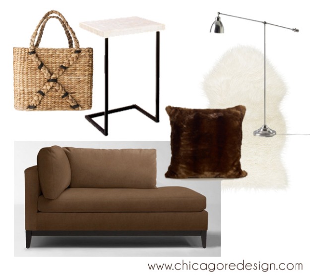
For a luxurious retreat mix opulent materials, interesting textures, plush fabrics, and plenty of shine. An interesting basket keeps reading materials close at hand while a laptop table provides a convenient spot to perch a glass of wine or warm mug of tea.

At-home retreat | Chicago ReDesignHandled basket | Side table | Chaise | Pillow | Throw | Lamp

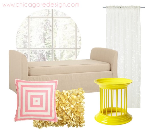
If your idea of bliss is curling up with a good book while soaking up the sunshine, add a daybed underneath a window. Keep the feeling light and airy with sheers, plenty of white, and pops of bright, cheerful color.

At-home retreat | Chicago ReDesignDaybed | Pink Pillow | Petal Pillow | Side table | Curtains

Do you have a favorite spot in your home to retreat to at the end of the day? I’d love to hear all about it in the comments section below!

Signature

Related Posts:
share request

Color Inspiration: 3 Hot Color Combos

Why let just one color have all the fun? Here are three hot color combinations you can use for an instant update to your room’s decor.

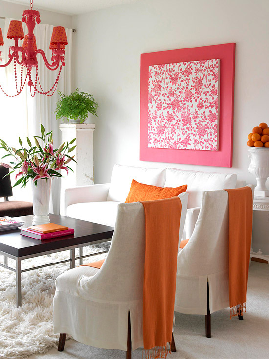
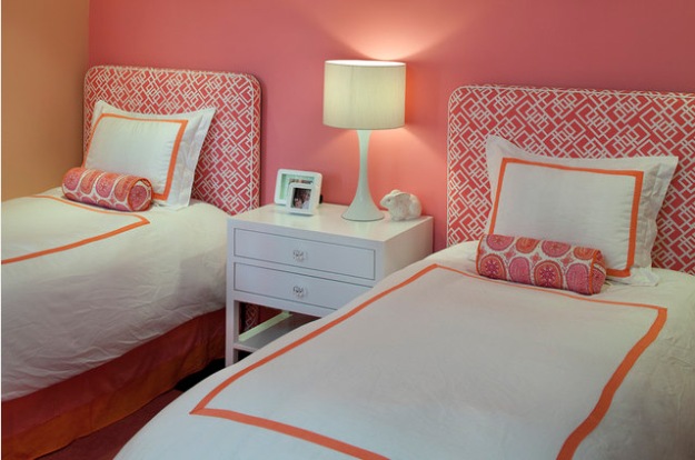
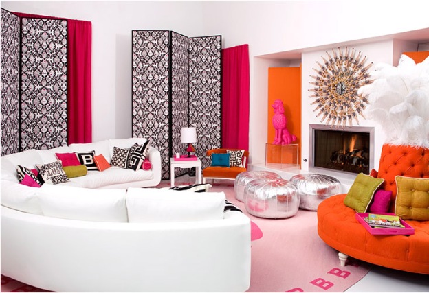
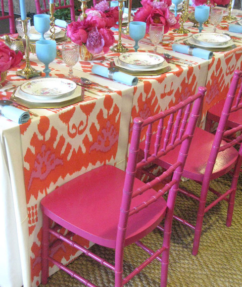
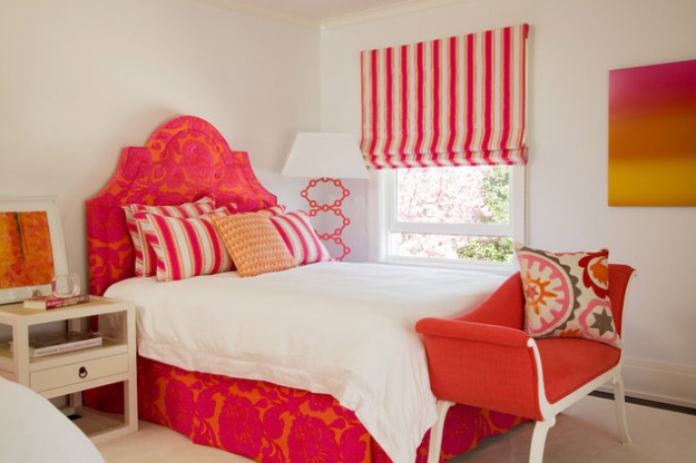
1. Pink + Orange

Bold, energetic, and youthful – Pink and orange is a fun combination that will add a huge dose of personality to any room. Make the colors pop against an all-white canvas, or layer in metallics, deep wood tones, and complimentary colors like aqua, plum, and green.

Color Inspiration: Pink + OrangeSource

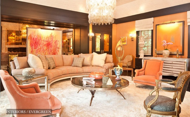
For an elegant, luxe look, use mellower versions of pink and orange (think soft blush and peachy hues) like Kelly Wearstler did in the sitting room below.

Color Inspiration: Pink + OrangeSource

Get the look!

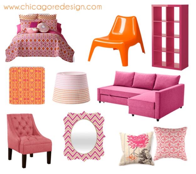
Hot Color Combo: Pink + Orange | Chicago ReDesignBedding | Orange Chair | Bookcase | Sofa | Pink Pillow | Print Pillow | Mirror | Pink Chair | Shower Curtain | Lamp Shade

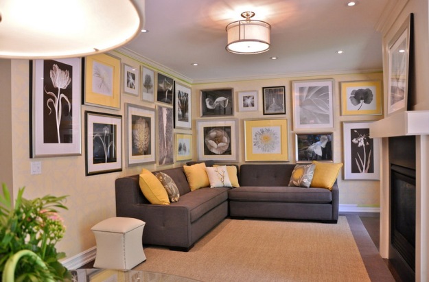
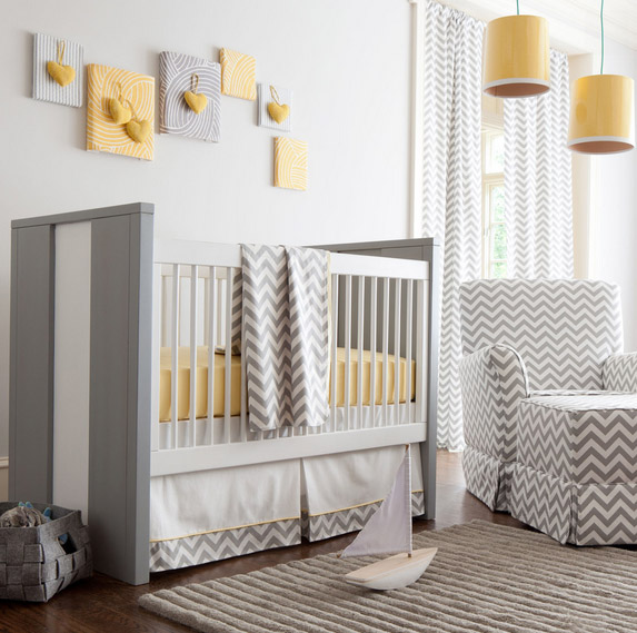
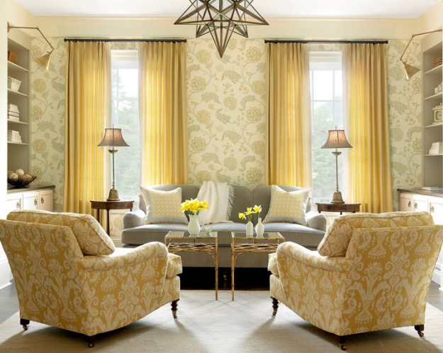
2. Yellow + Gray

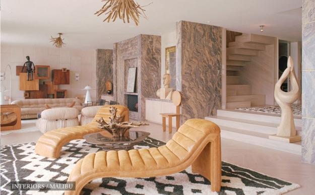
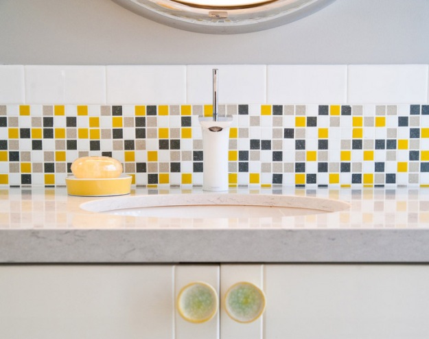
Sophisticated and modern – The contrast between warm yellows and cool grays adds balance to a space, and can simultaneously feel timeless and contemporary. Vary the feel of your room with the tone of each color – More intense yellows and darker grays will feel very modern and hip, while mute shades of sunny yellow and softer grays will feel cheery and relaxed.

Color Inspiration: Yellow + GraySourceColor Inspiration: Yellow + Gray Source
Color Inspiration: Yellow + GraySource

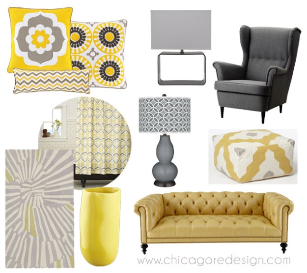
Get the look!

Hot Color Combo: Yellow + Gray | Chicago ReDesignPillows | Square Lamp | Armchair | Pouf | Sofa | Vase | Rug | Shower Curtain | Gourd Lamp

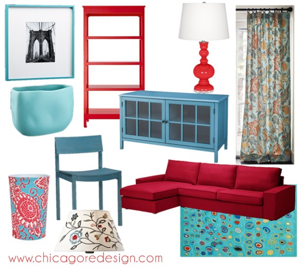
3. Red + Aqua

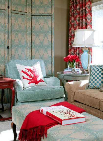
Dramatic and exotic – Red and aqua (or turquoise, or light blue if you prefer) will certainly make a statement that people remember. For the walls, light taupe shades make a great backdrop for this stunning combo to shine. Add in gold and ochre hues as well as natural elements like bamboo shades or a sisal rug to bring a calming influence into the space… or play up the contrast with other pops of bold color like yellow and green.

Color Inspiration: Red + AquaSource

Get the look!

Hot Color Combo: Red + Aqua | Chicago ReDesignFrame | Vase | Bookcase | Media Console | Lamp | Drapes | Couch | Rug | Lamp Shade | Trash Can | Dining Chair

Which ones of these is your favorite combination? Have you decorated with ones of these palettes before? I’d love to hear more!

Signature

Related Posts:
share request

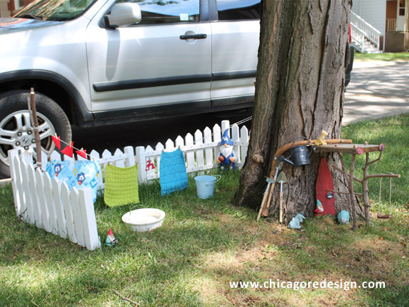
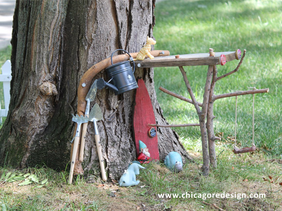
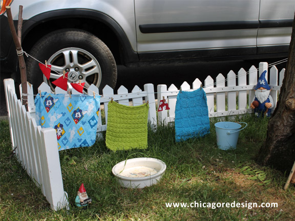
Design Inspiration: Gnome Home

Somebody set this up in the parkway down the street from me and it’s so freakin’ FANTASTIC I had to share it…

Gnome House | Chicago ReDesignGnome House | Chicago ReDesign Gnome House | Chicago ReDesignThis absolutely made my day when I came across it… there is such a sense of magic and wonder to the whole thing. I think this would be a really fun and special DIY project to do with my daughter (and husband) so I’m definitely keeping it in the “To Do” file for when she gets older.

Don’t you just love it!!

Signature

Suggested Reading:

share request

Color Inspiration: Gustav Klimt’s ‘Golden Phase’

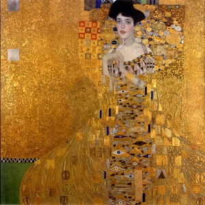
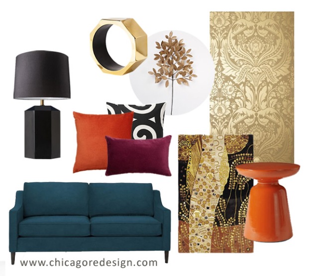
I absolutely love the artwork of Gustav Klimt, so this week I was inspired to put together a mood board based on work produced during his ‘Golden Phase’. As I’m sure you can glean from the title, gold is featured heavily in the palette of these pieces (Klimt often used actual gold leaf in the work and it’s truly spectacular when viewed in real life) but with an ample dose of color. Rich blues, bright reds and oranges, deep greens, and even art-deco-ish blocks of black compliment the metallic gold “star” in these paintings.

Color Inspiration: Gustav Klimt's 'Golden Phase' | Chicago ReDesign

Gustav Klimt, ‘The Kiss’

Color Inspiration: Gustav Klimt's 'Golden Phase' | Chicago ReDesign

Gustav Klimt, ‘Adele Bloch-Bauer I’

My mood board…

Color Inspiration: Gustav Klimt's 'Golden Phase' | Chicago ReDesign

Lamp | Lampshade | Sculpture | Leaves | Wallpaper | Side Table | Rug | Couch | Purple Lumbar Pillow | Gold Flame Pillow | Black + White Pillow

Let me know what you think. Do you like the gold + color palette? Also, what inspires you? If you have any mood boards you would like to share send them my way – I love to see what others have created!

Signature

Related Posts:
share request

{Guest Post} Beyond Neutral: Bold Color

Hello, everyone! I’m so happy to be here with you at Chicago ReDesign today with a guest post from Arcadian Home blog. It’s a fantastic place to find interior design inspiration including great decorating ideas for everything from beautiful foyer lights to chic decorative accessories.

Taryn recently published a post about neutral color palettes in which she mentioned that she also loves colorful rooms. That inspired me to do this guest post on some of my favorite spaces that go beyond neutral with bold color. From small pops to four walls of color, these room designs use bold hues to achieve great results. Please enjoy!

~ Mari

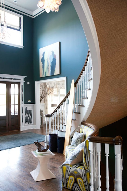
1 Bold ColorSource

The soaring foyer in the 2011 Hamptons Showhouse is painted a bold teal that looks stunning with warm woods on the floor and curving stair rails. Both color and pattern go bold on the banquette.

2 Bold ColorSource

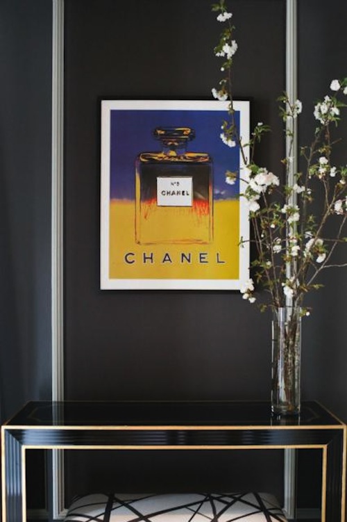
Here, neutral walls get a gorgeous burst of color from a low-hung Chanel print. It seems sometimes less is indeed more when bold color meets a neutral interior space.

3 Bold ColorSource

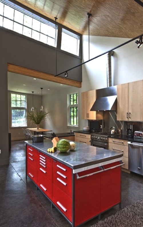
In this industrial style lofty space, a very neutral kitchen and dining room are kicked up a color notch with a bright red metal work island topped in stainless steel.

4 Bold ColorSource

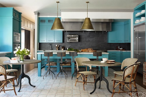
Chef Bobby Flay’s home kitchen started out with a neutral palette, and then came gorgeous turquoise cabinets and center island. Bold and beautiful, this is the ultimate chef-worthy kitchen. Thomas O’Brien modern pendant lights are perfect in this space.

5 Bold ColorSource

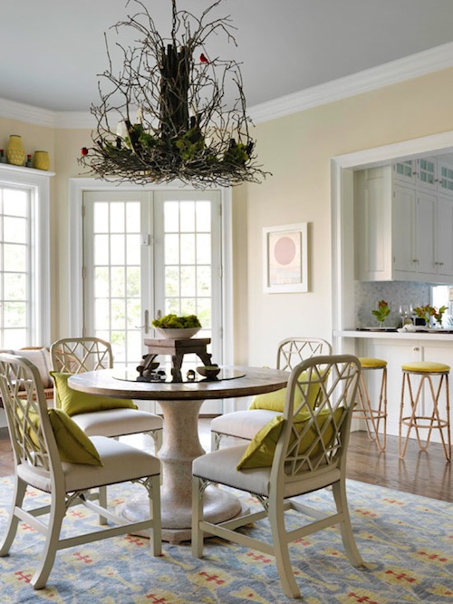
It’s easy and a lot of fun to take a neutral palette and turn it into something really special with a bit of color like the chartreuse elements added to this showhouse dining room.

6 Bold ColorSource

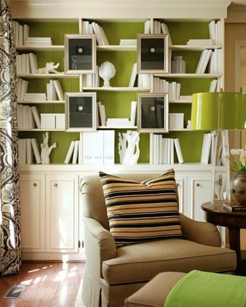
On another green note, this neutral palette was taken to another level with bold green inside the bookshelves and on a few decorative accessories. We often see white shades on contemporary floor lamps, but here a glossy green substitute is the perfect choice.

7 Bold ColorSource

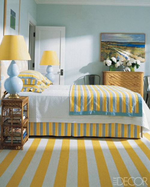
In this sunny bedroom, stripes intensify the bold yellow chosen to contrast with appealing sea blues. Just a lively happy space!

8 Bold ColorSource

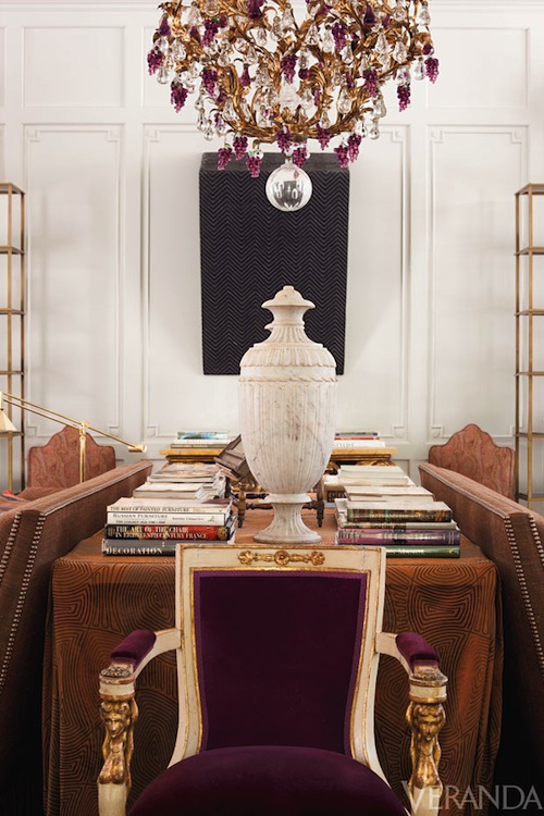
And we leave you in a traditional room with a neutral palette that suddenly goes bold with jewel-tone velvet chair and updated ornate chandelier.

What do you think of these bold room inspirations? Leave us your thoughts below and stop by our blog for more home accessories, lighting, and interior decorating ideas!

**Thank you Mari and Arcadian Home for the great post!**

Signature

Related Posts:
share request

Have a Seat! 5 Awesomely Affordable Dining Chairs

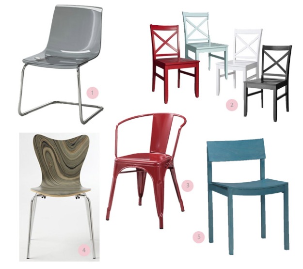
Let’s face it, dining room chairs are expensive. If you are the patient type you can squirrel your money away and save up for the perfect set. However, if you are like me and you want instant gratification, it means finding something affordable that is also stylish, of decent quality, and comfortable. I know, I’m needy (and cheap). Well, here are 5 awesomely affordable dining chairs that in my opinion, fill quite the tall order.

Dining Chairs

  1. TOBIAS chair, Ikea, $79.99 – Available in clear or gray, but I love the sleekness of the smoked gray… to me there is something a little more sophisticated and modern about it.
  2. Threshold Carey Collection, Target, $95.99 set of 2 – Available in a variety of colors (shown above). The cross detailing on the chair back is just different enough to be interesting, and the simplicity means the chair fits in with just about any decorating style you have.
  3. Carlisle Dining Chair, Target, $99.99 set of 2 – Available in copper, distressed metal, or red salsa. This fun and modern chair is perfect for those that like to entertain or need something kid friendly – it can be easily cleaned by wiping with a damp cloth.
  4. Scoop-Back Chair, West Elm, $198 set of 2 – Available in white, chocolate, or marbleized. I adore the marbleized pattern on this classic scoop-back chair. It elevates the design and makes it feel a little more high-end than it actually is (don’t worry, it will be our little secret)
  5. Slide Aqua Wood Chair, CB2, $129 – If you want to make a statement, this bright, bold chair is the way to go. With a modern aesthetic, this chair was designed with compact spaces and comfort in mind.

Signature

Related Posts:
share request

Get The Look: Blue Moroccan Bedroom

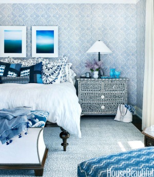
Bedroom Designed by Martin Horner | House Beautiful

House Beautiful

The May edition of House Beautiful featured a Michigan lake house designed by Chicago’s own Martin Horner. The color blue is prominent throughout the home, as are Eastern elements and detailed patterns. I absolutely loved this blue bedroom and wanted to steal the look for myself (which is odd because I normally don’t go for this much color and pattern). But the monochromatic palette and lush layers of pattern work to create an interesting retreat where one could escape to relax and recharge.  I think it would be like a mini-vacation to a far-off land every time you stepped into the room. Honestly, I kind of wish I could dive into this photo and hang out here for awhile.

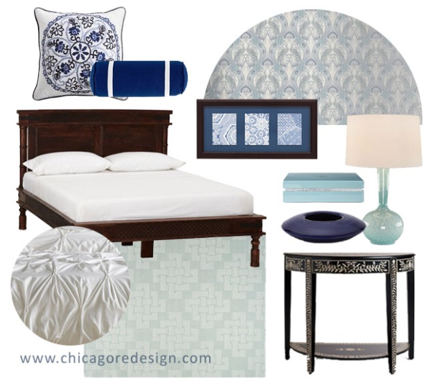
So here is my budget-friendly take on the room above…

Get The Look: Blue Moroccan Bedroom | Chicago ReDesign

Pillow | Bolster | Wallpaper | Bed | Artwork | Box | Bowl | Lamp | Bedding | Rug | Side Table

What do you think? Do you like all the blue or is it too much for your tastes? Do you think this look would work with any other color? I’d love to hear what you have to say!

Signature

Related posts:

share request

Book Review: Alberto Pinto Orientalism

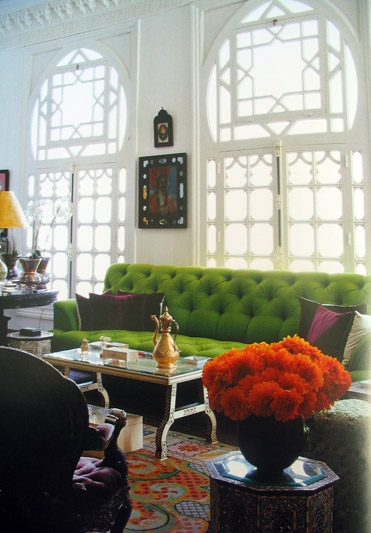
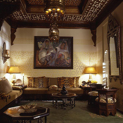
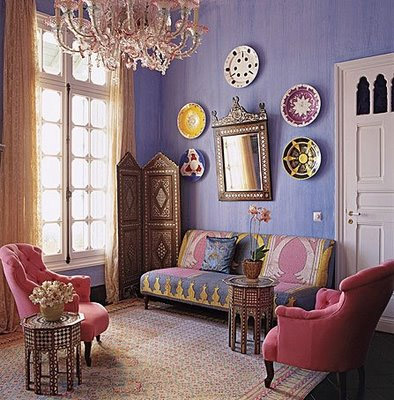
Alberto Pinto OrientalismI was rifling through some of my books the other day and I came across one of my all time favorites for design inspiration – Alberto Pinto’s Orientalism. The book is full of images of Pinto’s genius take on Eastern interior design, “inspired by the colors and textures of Morocco, Byzantium, India, and beyond.”

This book is a visual feast that nourishes the part of my soul that craves all things exotic and Eastern. Included are opulent interiors located in Europe, the Mid East, and North Africa that feature sumptuous materials, exquisitely intricate details, and rich, decadent colors, all with a modern aesthetic.

“The key to Orientalism according to Alberto Pinto is observation. For example, the gaze of Western culture which once it has discovered the Orient and has fallen under its fascination, sets about to interpret it, to play with transcultural aesthetics.”

Alberto Pinto OrientalismAlberto Pinto

Beyond the photographs, a beautifully written forward provides a glimpse into Alberto Pinto’s approach to Orientalism design, and each project featured in the book is accompanied by vivid descriptions of the interiors.

Alberto Pinto OrientalismAlberto Pinto

“Often Alberto Pinto’s interiors cultivate a very literary Orientalism… which teemed with innumerable references and subtle dis-synchronizations.”

Alberto Pinto OrientalismAlberto Pinto

Although the price of this coffee table book has apparently gone up since I purchased it about 5 years ago, I still feel it’s worth the cost. Even after all these years I still love slowly grazing through the images, delighted by the visual journey each and every time.

**UPDATE** I finally found a site that is selling this book for it’s list price of 75 USD!! Check it out here.

Signature

Related Posts:

share request